Work / Branding + Graphic Design / Safflower Acupuncture

Safflower Acupuncture
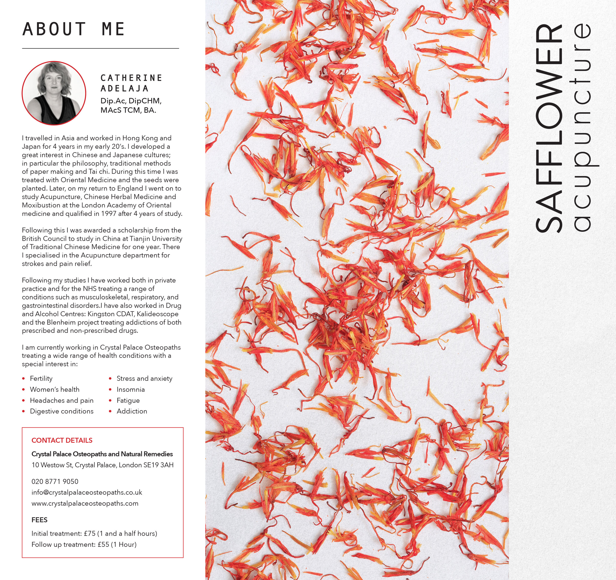
Safflower acupuncture wanted to keep their current logo, but evolve the look and feel of the application of their brand to reflect their gentle approach as well as their love for Asian culture, having spent time practising Eastern medicine in China and Japan. In this redesign, Safflower petals have become the focal image to represent the brand, along with soft, red and orange gradient background iconography and images of soft and calming landscapes.